
Docshunter, re-design the document searching tool
Docshunter is a website that allows users to search through thousands of documents in various subjects and categories.
My role:
I led the UX design project, enhanced the design system and collaborated in a team with 1 project manager, 6 frontend and backend developers, 1 business analysis
Final result:
Figma Prototype link can be found here
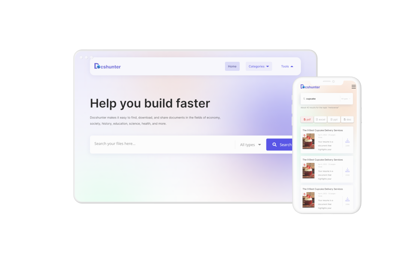
- Redesigned the responsive landing page for both mobile and desktop view-points
- Improved other elements for enhancing the user usability, together with improving and enhancing the design system foundation
- Collaborated with developers to successfully launch the new version in September 2022
- Number of visitor +22%
%2520copy.png)
.png)
discover
To get started, I had the kick-off meeting in the team with project manager & developers to get to know about the current situation of the product and collect the user feedbacks. According to the meeting brief, there are some highlight requirements that need to be focused to update the application in the next launch.

GOALS:
- Enhance the overall user experience that keeps the existing user engaged more.
- Design the new landing page to increase visitor rate.
Define
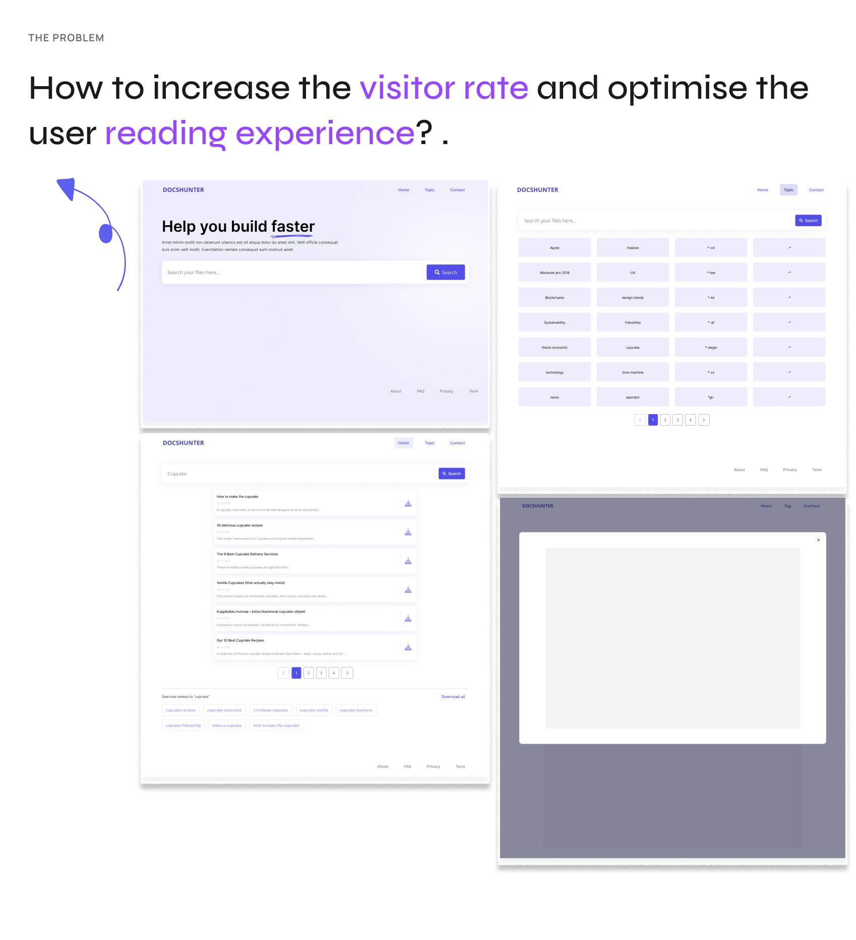
Put myself on the user's shoes, I walk through and evaluate the website
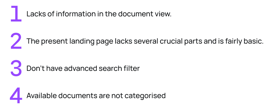
Based on the visual & interaction perspectives, I identify a number of critical issues that Docshunter currently has.

Problem summary:
Ideate
Prioritising the user needs & pain points
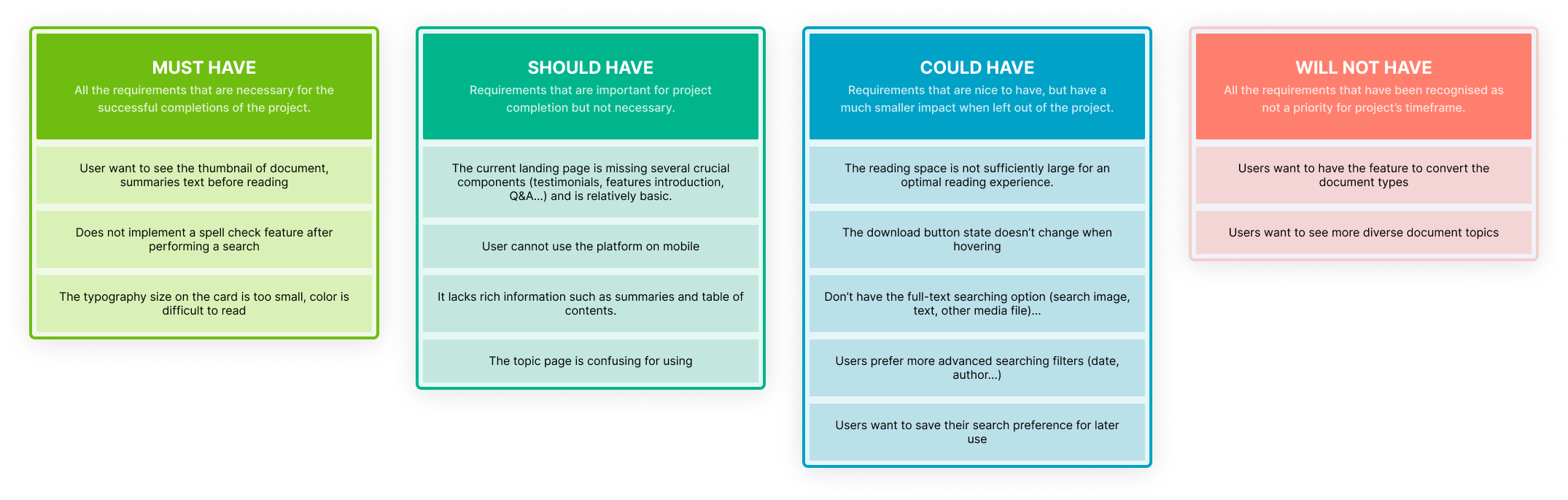
The time is limited and we cannot resolve all the user feedbacks in a certain of time. Therefore, I need to priority the user needs and pain points. I utilise the MOSCOW framework to categories them into the one roadmap.
I conducted collaborative sessions with the Product Manager and other team members to finalise the userflow & changing proposals. We focused on mapping out the user flow to ensure the solution aligns cohesively with the searching tool.
prototype
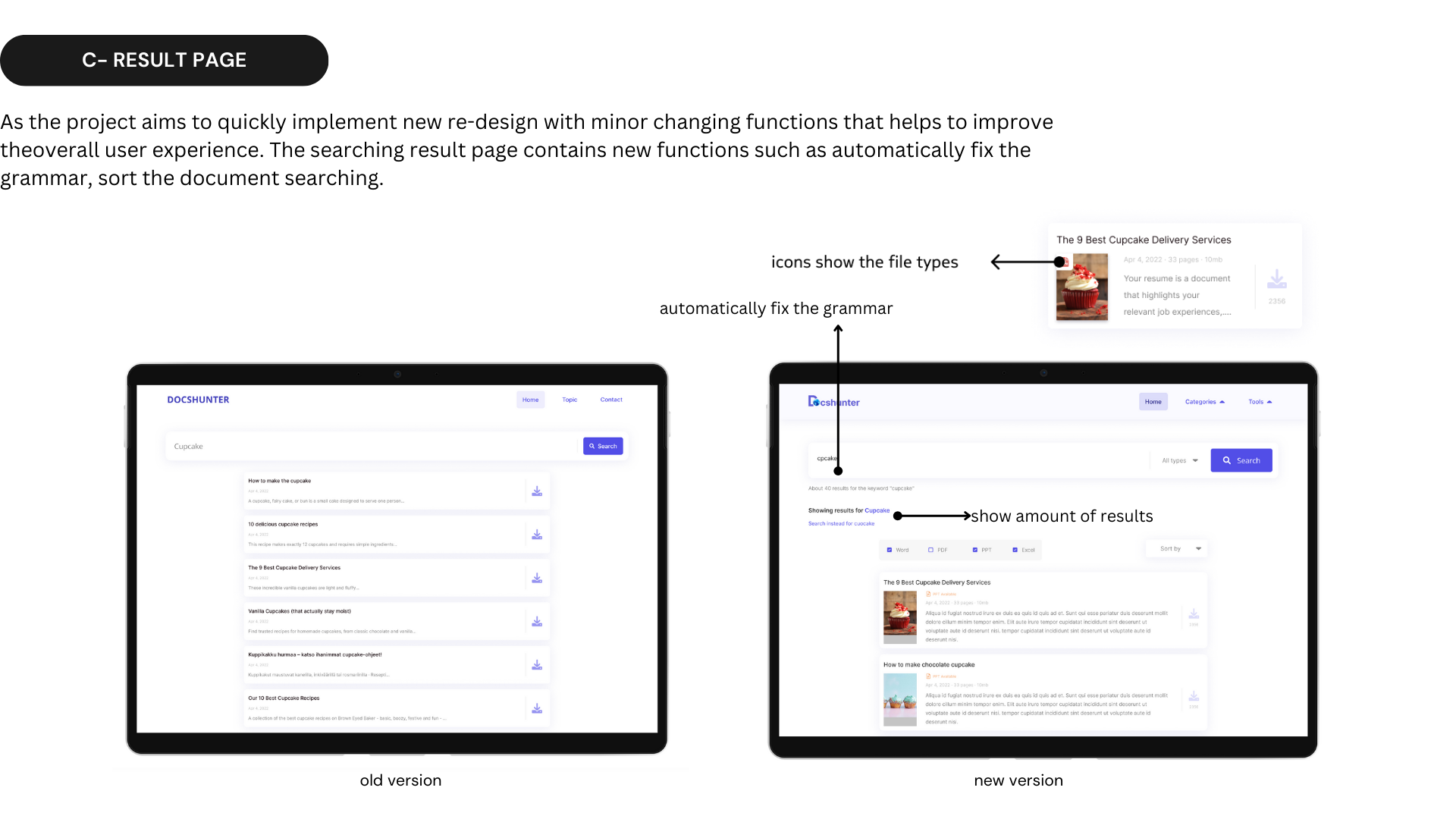
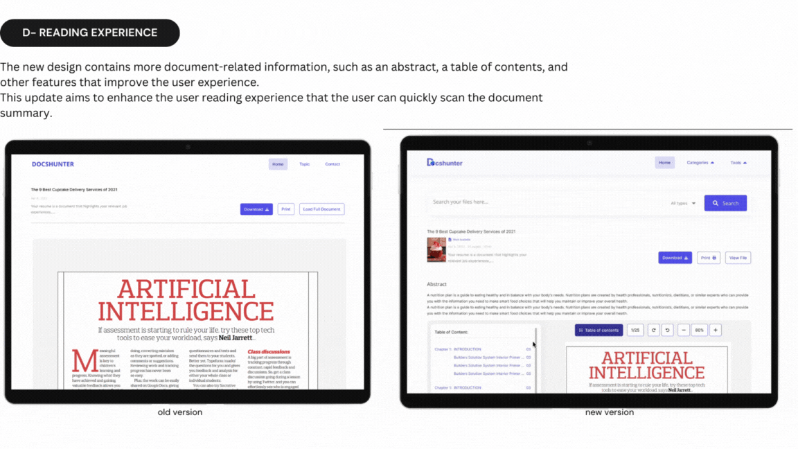
The prototype is created using the available design system. I also enrich the design system with new elements and some minor changes.
Though more elements are developed and some small design changes are made, the design concept is still based on the brand identity & design system to keep the consistency of the product. The new version has received many positive feedbacks and is really generating an increasing number of users.
The mobile version has the limited space requires to have different design for the categories table interface.
I had a small workshop to conduct the A/B testing and present two designs that I made for the mobile application in order to identify which options that is more feasible in the perspective of the whole team.
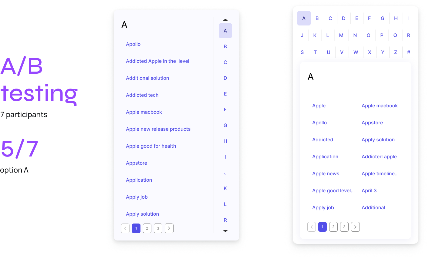
After the discussing with the product manager & development team, we decided to go with the option A because of several reasons:
- The space for each letter on the option B is too small so user can make the mistake when typing
- There are also limited spaces for the long keywords that makes the screen B limited the word counting appeared on the screen
reflection
L E A R N I N G
I had the wonderful opportunity to collaborate directly with the development team throughout this project,
I was able to learn a lot about how to build a valuable website while still taking various viewpoints, screen sizes, and other considerations into account.
Accessibility issues are still not solved yet,
It can be considered more in the next phase
Although creating wireframes for the website was a difficult challenge for me,
It encouraged me to think about what components the website should have. Eventually, I came up with an appropriate interface for the new functions.