
Case study: Healer, mental healthcare application
Many people nowadays suffer from many difficulties in modern life and struggle with daily depression and unhealthy eating habits. Healer is the application that can help users reduce the sorrow & keep fit
My role:
This is my first hand-on design project that I did for the Google UX Design Certificate. In this project I did all steps including: User research, site structure, wireframes, low & hi-fi prototypes and testing

empathise
User research:
In the empathise process, I did some researches to empathise and determine my target users. Accordingly, I conducted the quantitative methodology using the google survey form. The survey has successfully obtained 52 responses. I did this survey to learn about users' situations and pain points. Therefore it's easier to create a suitable product that adapts to their needs.
Research insights:
The research reveals that more than half participants are males.
Significant numbers of respondents are struggling with their emotional problems, such as depression or anxiety regularly.
Also, a substantial amount of them had some problems with physical health and want to have better eating habits

"Almost 90% of respondents were fascinated and prefer to have the mental healthcare app but cannot find the suitable application for that"
define
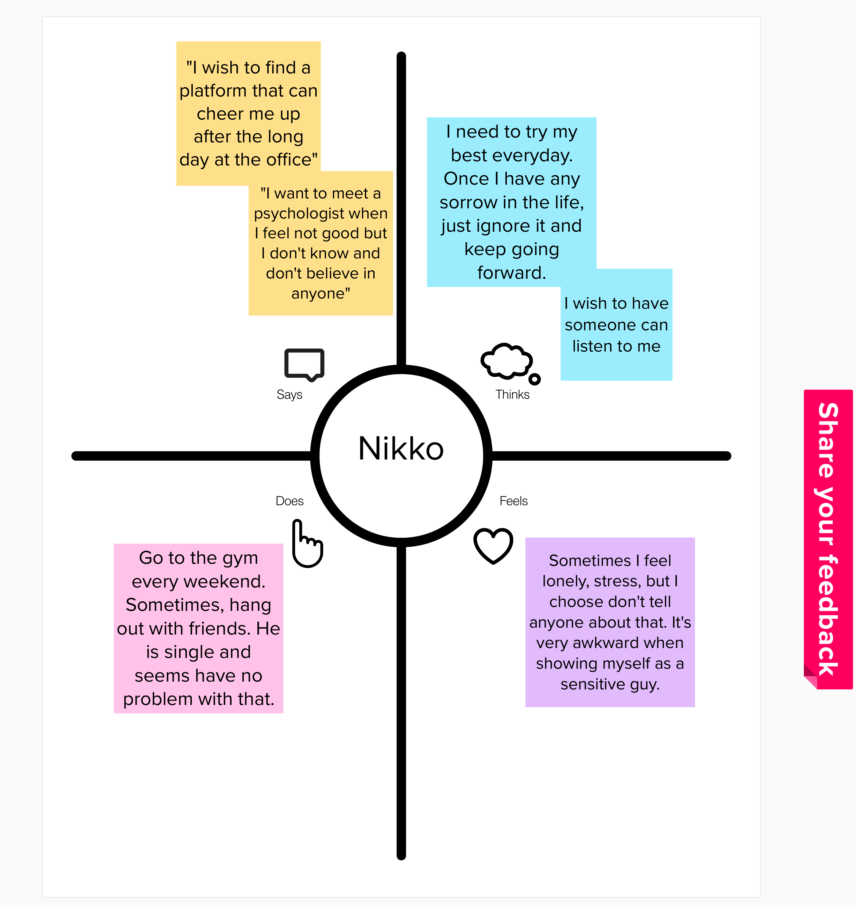
Affinity Diagram
When conducting the survey, I put open-ended questions to more deeply understand user problems.
I gathered all their answer and synthesize these data into the affinity diagram. The complete affinity diagram has been done by combining similar thoughts and ideas expressed during the interviews into four main groups.
These groupings were made by identifying themes in participant responses. Each theme represents the user pain points that need to be taken into consideration in the design step.

User persona & user journey map:
Understanding users is a crucial part of the project because the finalproducts are created based on their preferences and thinking. Focusing on their pain points, I created the user personas for the project.

-> Regardless of research insight, most of the responses are male and they're young workers. It seems people in the Millennials generation are struggling with their daily emotions and stressful job.
ideate
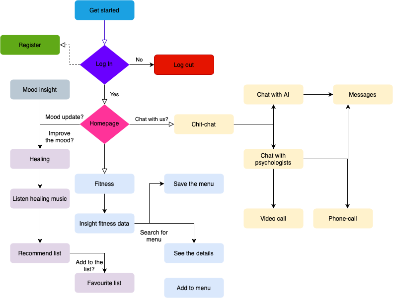
Site structure:
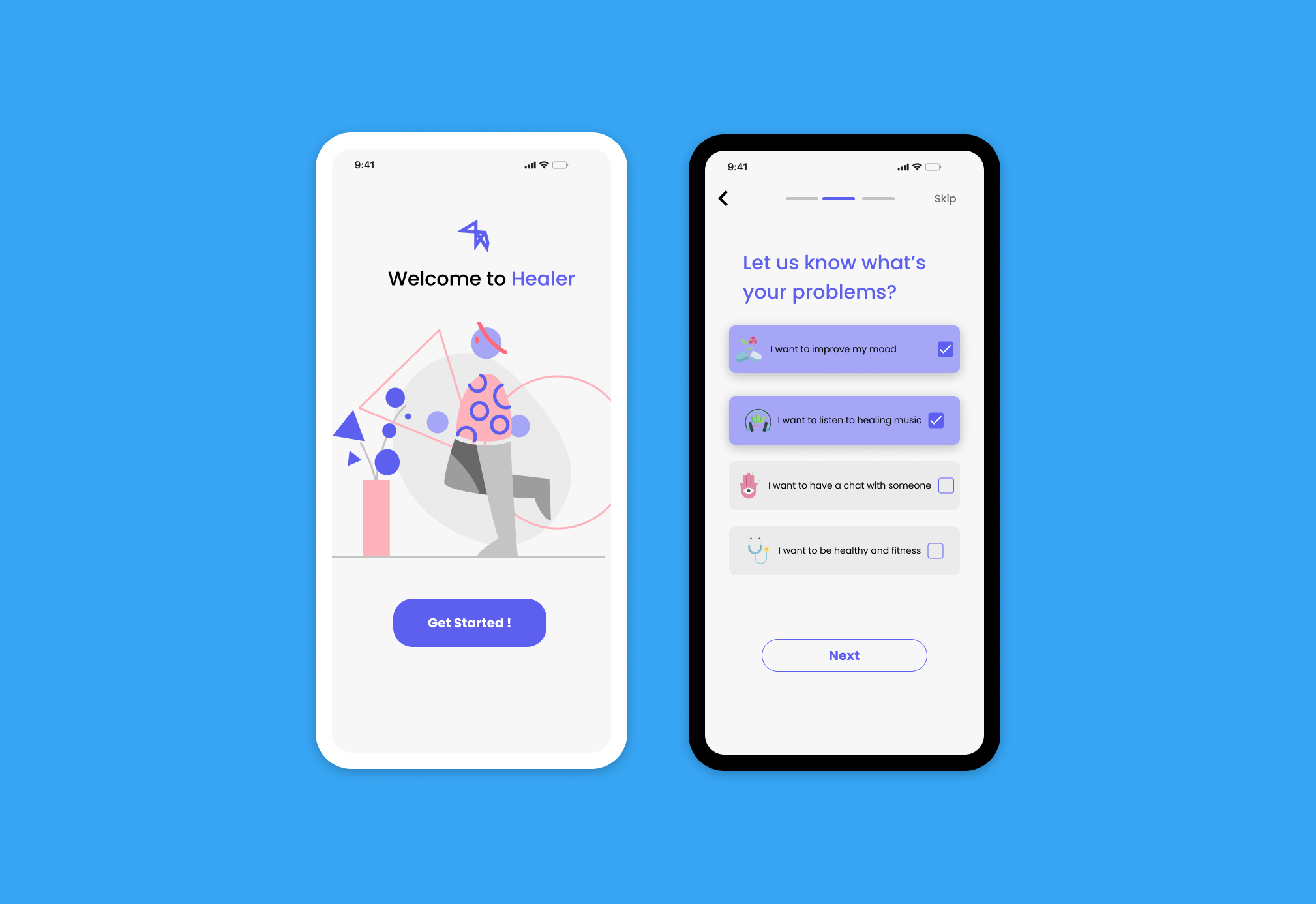
Wireframe:
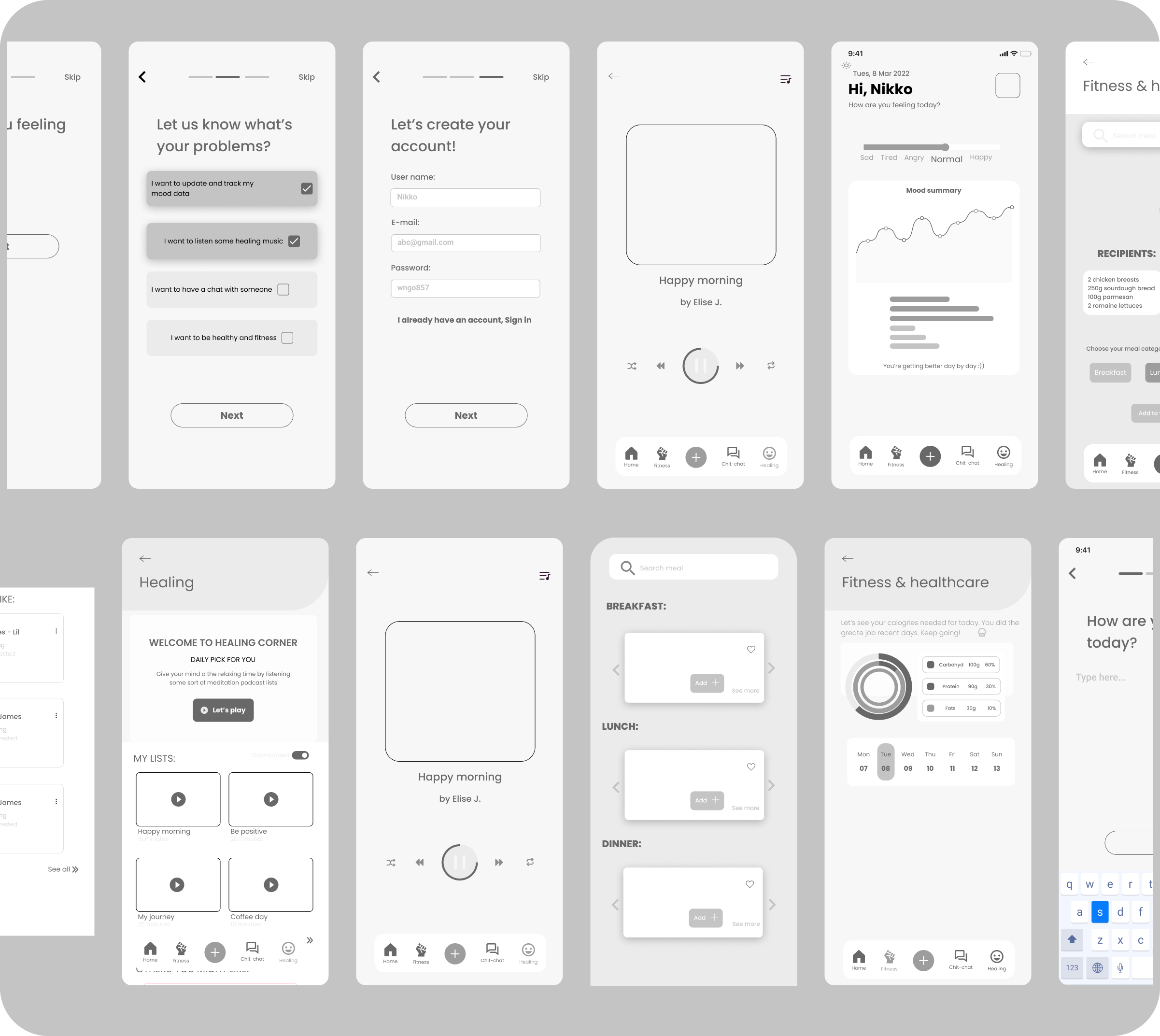
According to the site structure, I sketched some wireframes to layout content and functionality on the app that I suppose to create. These wireframes were created based on user needs and user pain points.

Wireframes are used early in the development process to establish the basic structure of a page before visual design and content are added.
prototype
Design system & hi-fidelity
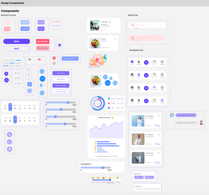

Feature details:
LOG-IN PAGE:
The log-in process was streamlined so that the app developer can have information about what the most common user needs for the product development.

HEALING PAGE:
Healing page literally provides relaxing music to help users release stress and fresh their minds. Music was categorized in different sessions so users could easily choose.

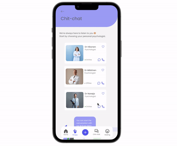
CHIT-CHAT PAGE:
Users can freely choose the suitable psychologists on the list to start a conversation with them. When the app was launched on the market, this feature could be used for the premium version. Otherwise, they have another option to start a chat with "Mr Healer", the special AI of app
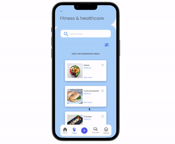
FITNESS & HEALTHCARE PAGE:
Accordingly, users can understand how many calories they need per day to keep fit. The app provides a menu per day with detailed recipients and insights for users to follow in their eating routine. Users also can use the filter feature to adjust their favourite menu for a day.
testing & wrap-up
Testing scenario:

Although it is preferable to do usability testing just after the low-fidelity prototype process, I choose to get it at the latter so that users may perceive the app with a high-fidelity visual design and some limitations can be improved in subsequent rounds.
Again, usability testing is compulsory after completing the design stage. Together with the test results, I can identify the strengths & weaknesses of the design.
User feedbacks combination:

L E A R N I N G
When conducting the test among users, significant problems are that people themselves are not aware of the fundamental reasons that make them feel uncomfortable or confused when using an app. So, I've been concerned about observing the participants while following up on their stage of action. After all, I got a lot of valuable feedback, which could be used for my next product development step.
The entire process was indeed intense, and I learnt a lot. More importantly, it's exciting to receive various responses from different respondents while using the quantitative methodology, since each user has different pain areas and perspectives. Even so, it is feasible to develop solutions that benefit them and are valuable to me.
Next step...
- The healer app has a couple of errors that need to be improved in the future. The alternative logo and branding design should be updated. Furthermore, keep testing and testing constantly in order to integrate and develop the design in the next rounds.
- Still, UX design is a long journey of working, studying and practising from time to time. I can't wait to continue with this path.